Targeting emotions and finding hidden value to boost PPC landing page conversions 61%.
The Overview
Newswire.com is an online only press release and distribution service. They have a highly rated and affordable service aimed at businesses and organizations of all sizes. Newswire hired CI to overhaul their primary landing page used for search ppc traffic.
The Challenge
Strong landing page conversion rates are the life blood of any PPC campaign. Competition and cpc prices are crazy.
You have to stand out. No buyer chooses the second best option they find.
Your visitors need to see you as the 'obvious best choice'.
So how do you do that without lying? You take what you have and you get creative.
Newswire.com was barely breaking even on their adwords campaign. They had a good service, but they had a lot of competition that was offering the same thing. My job was to take their primary LP and improve it's performance significantly.
This was going to be tough because - real talk - their service wasn't unique or superior to their competitors.
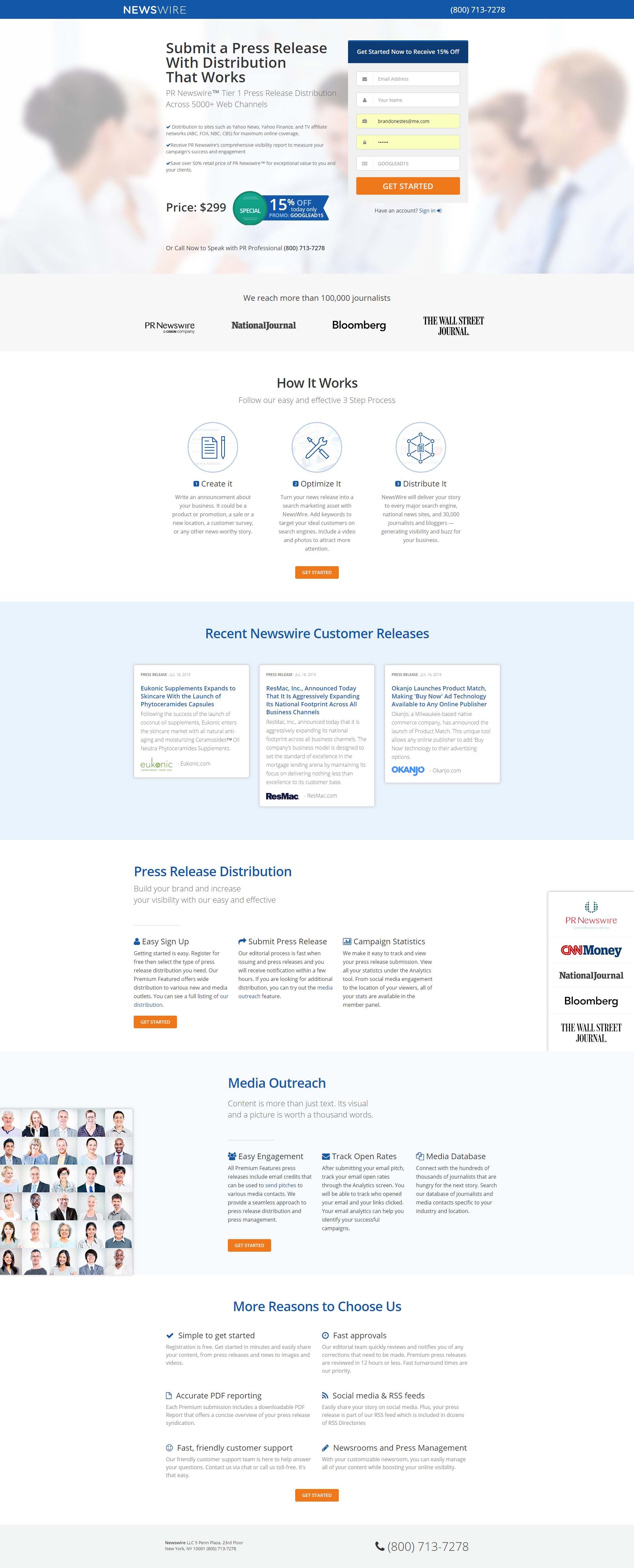
The page we needed to improve
The existing LP was less than ideal. They were hitting on important elements (social proof, explaining how it works, what the customer gets, etc), but it just did not come across as convincing.
I mean, I wouldn't want to pay $300 for this...

One of the biggest problems landings pages make is not communicating a strong overwhelming case for their product/service. They put up some social proof, they talk about what they do and why it is great, but everything on the page feels a little disjointed. A little untrustworthy.
Want people to buy from you? They must beleive you are the best solution for them. I sometimes refer to this as being the 'obvious best choice'.
The case being made on this LP is just not strong enough for people to trust that the product/service is actually high quality. Think of a sales person who you can tell isn't really confident in what they are saying. This LP just don't come across as 'confident'.
In order to make a strong case, we neeed to answer:
- Which messages are critical to conversion? What messages are just 'extra’ or don't impact the conversion desicion?
- Should we lead with a benefit or outcome, a feature, or just clearly state what the product is (i.e., press release services)?
- How educated are people about this type of product? Knowing this helps determine how much we need to explain
- Are there any overlooked features or aspects of the business that people would find valuable?
Here’s how we answered those questions, and helped newswire.com increase conversions.
The Solution
In conversion optimization, research & discovery is everything. You can’t improve something without first know what the problems are.
This is the exact process I follow to find ideas worth A/B testing:
1. Fire up analytics
Before you can do anything, you need to get a general idea who we are talking to. Where is the traffic coming from? What keywords are being bid on? What devices are people using? Where are people coming from geographically?
2. Talk to your current visitors
We typically use hotjar polling for this, but many tools work. We ask a battery of questions designed to uncover problems (what info is missing, is something on the site not working, etc.) and understand what motivates visitors to buy, why they're not buying, etc.
The idea is to ultimately understand the why. Why are people looking for this product? What is the transformation they think this product will bring to their lives?
Remember, people don't buy products or services. People buy transformations. People buy the AFTER-effect.
3. Talk to your past customers via a Survey
Knowing why people buy is just as important as knowing why people didn't buy.
The best way to talk to current and past customers is via an email survey. Incentivizing the survey with a free amazon gift card is usually the best way to get responses
We sent 1 survey to 3 segments. New buyers, One time customers who didn't return, Repeat customers.
Again, the objective was to understand:
– The EXACT pain they expected your solution to fix for them. What is the AFTER-effect they were hoping to get?
– The "happy surprises" they’ve found while using the product/service
– How they describe the solution (Use their words in your copy)
– The words that keep occurring naturally (which is where the copy gold is)
The key parts to take away from this exercise should be:
a) A proposed messaging hierarchy...based on data
b) An understanding of what to say about your offering, and how to say it... based on data
c) Words to use to explain your solution… based on data
d) A general profile of who you’re targeting… based on data
4. Watch visitors as they move through the LP
We use hotjar session recordingss for this, but there are other tools that are just as good.
The usefullness of session records can be hit or miss. With landing pages I'm not really looking for usability issues. Instead, I'm looking for engagement. Are people reading? Do they seem interested. What sections of the LP are people paying attention to?
The Results
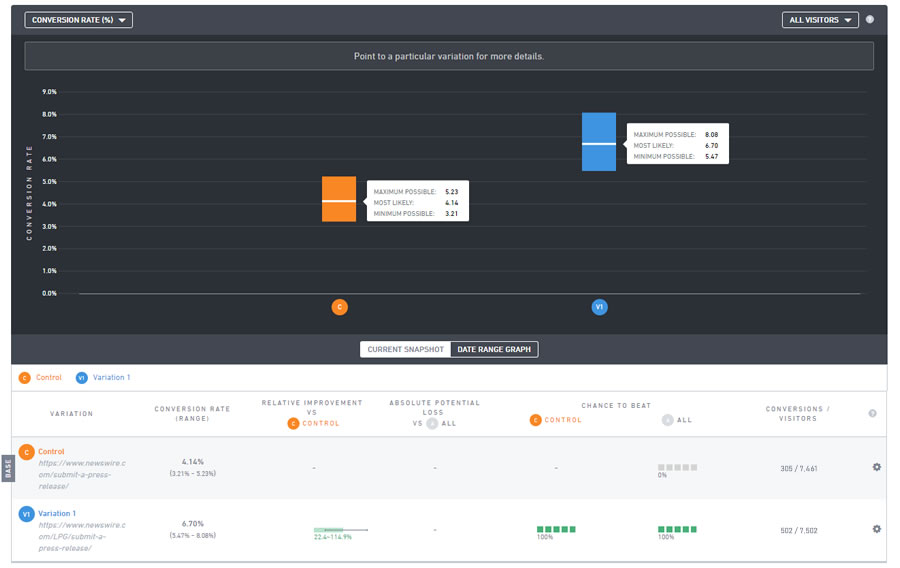
After building out a long form landing page that was 2x the size of the original, we ran a conclusive test that showed a 61% boost in sales.

